A new name for our next chapter.
The same bold ambition, built to scale across Africa.
Zazu was created to challenge the way businesses manage money.
As our footprint across Africa grows, our identity is evolving to reflect the scale of our ambition.
Our name needed to grow with us.
So, Zazu is becoming Manza.
A name built from our identity
We wanted to keep the Z, a symbol of the disruptive spirit that has defined us from day one.
Manza draws inspiration from Mansa Musa, the legendary African ruler often known as the wealthiest person in history.
But his legacy was not only about accumulating wealth. It was about putting value into motion, through trade, learning, culture, and generosity. A symbol of African prosperity, influence and shared value.
Mansa + Z = Manza.
A name inspired by African history.
Built for Africa’s next generation of businesses.
More than a new name
Manza brings our identity in line with the scale and ambition of our journey.
Our mission remains unchanged, to give African businesses the financial tools they need to move faster, operate better, and create more value.
New name. Bigger chapter.
Welcome to Manza.
Discover the story behind the name →
The design behind the name
Manza inherits a visual system built before it: a symbol, a palette, a typeface pairing and a set of rules that govern the brand across every surface. The name changes, the system carries on. Here is how it works.
Five paths, one point
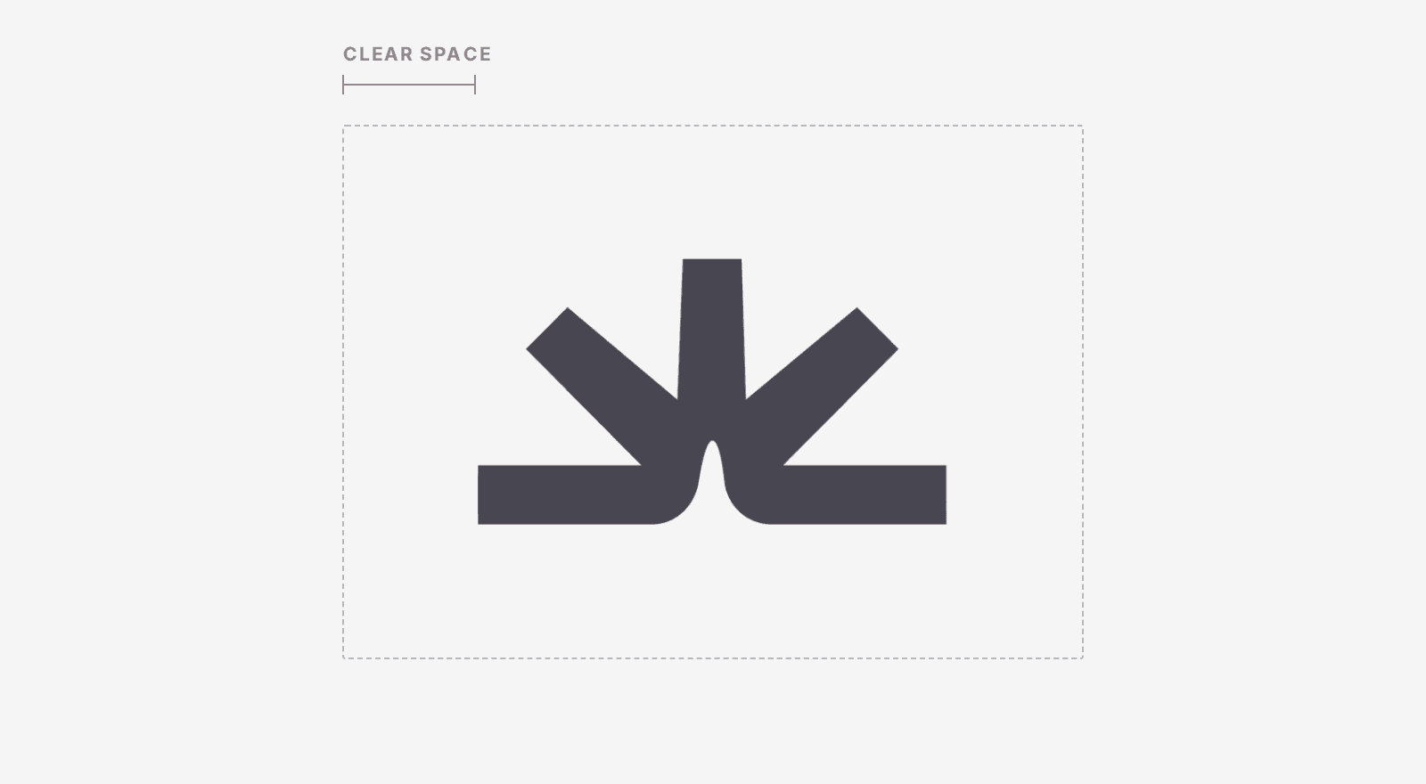
Clear space equals half the height of the symbol, on all four sides.
Five strokes converging on a single point. It is the idea that has carried the brand since day one, and the one that ended up naming the company: value moves, then it gathers. Collections, payments, cards, transfers, invoices. Five flows, one account.
The geometry is locked. The symbol keeps its exact aspect ratio, clear space equal to half its height, and a minimum size of 20 pixels. At that size it stays legible on a phone screen and on a card.
Earth colours
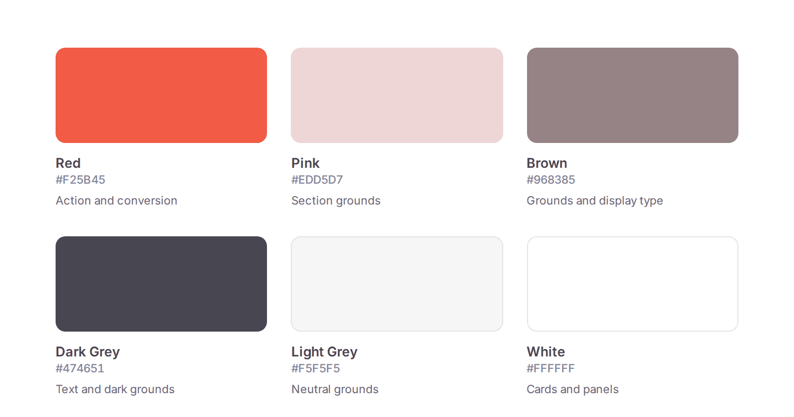
Six colours, each with an assigned role.
Brick red, clay pink, brown, dark grey. Colours of fired earth, closer to a Karoo escarpment than to the neon palette of European fintech. Each shade carries a role: pink, brown and dark grey hold the section grounds, light grey and white carry everything else.
Red has one job
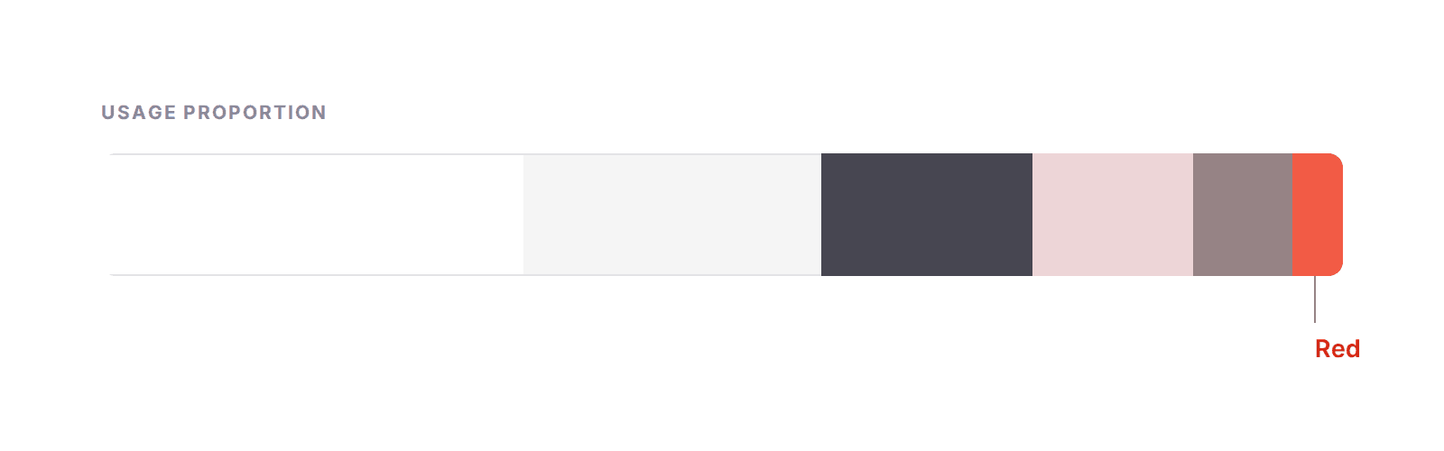
On a typical page, red takes the smallest segment of the palette.
Red marks the action: a button, a key figure, the top edge of a card. It stays the smallest block on the page, and it draws its force from that scarcity. One red area per screen, and the reader knows straight away where to act.
Two typefaces, two roles
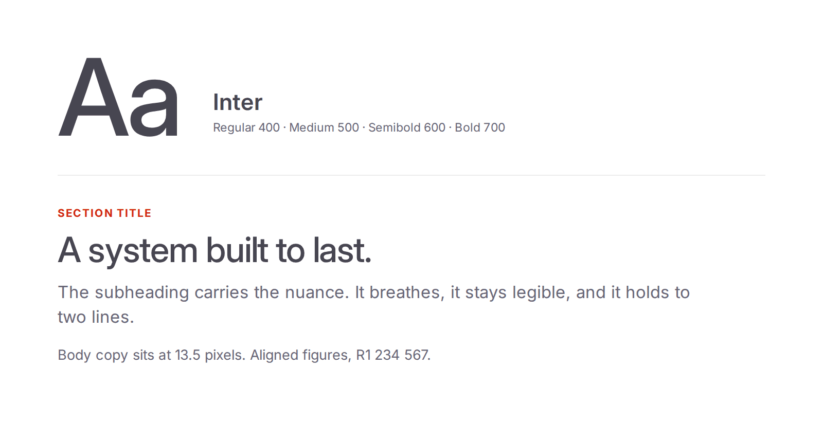
Inter, from the 10.5 pixel label to the section title.
Octave carries the headings, Inter carries the text. Octave gives the voice, with its open forms and its character. Inter delivers the clarity: drawn for screens, available in nine weights, with tabular figures that line amounts up in a column. Body copy sits at 13.5 pixels, with a floor at 12.
A system that holds on every ground

Four colourways, one per family of ground.
The choice follows measured contrast: dark grey reaches 6.7 to 9.3 to 1 on our light grounds, white reaches 9.3 to 1 on dark grey. The AA accessibility threshold sits at 4.5 to 1. We work above it, on every combination.
The word itself
That is where the work of the past weeks went. Manza has to hold on a phone screen and on a physical card, in light and in dark, and read as well in English as in French and in Zulu script. A wordmark drawn for three languages and two alphabets takes a different shape from one drawn for a single market.
*For our clients, nothing changes: your account, services, and experience remain exactly the same. Only our name is new.